
From The Atlantic:
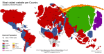
Two researchers, Mark Graham and Stefano De Stabbata, at the Oxford Internet Institute have depicted the world’s “Internet empires” in a map, [above]. The map shows each nation’s most popular website, with the size of nations altered to reflect the number of Internet users there.
The map makes for a brief, informative look at how geographic—and universal—certain web tastes and habits are.
